

Learning to Fail
The last project always comes with the most expectations. And expectations are heavy burdens to carry and meet. This one was another lesson in pride and failure.
The project was extremely intriguing, despite its somewhat revisionist premise, of taking 18th and 19th century paintings and 'updating' and reimagining them in the modern context in pastels and color pencils. I already knew what I wanted to draw: Naoya Inoue, a fierce little fighter from Japan, who I had stumbled upon in my YouTube feed. I didn't watch sports... well, other than the occasional fencing match--it's just so elegant. And two people in a ring battering each other, didn't seem worth watching. That is until, a very boring evening, I wondered, why does this keep popping up? Then, I learned. These fighters are geniuses. No, better. They were geniuses who've put themselves through unbearable training just so they can prove in the most public and real way--that is, in a way that can instantly have consequences.... It was amazing. I was hooked. I watched all his fights. I looked forward to his next one. And I looked for the perfect painting to recreate.
David with the Head of Goliath by Michele Desubleo was my choice. Despite the obvious Caravaggios with more drama, this was the one that caught my eye. Was it the quiet look of triumph? The rather obnoxious elbow on Goliath's head? The furs draped across him that I instantly imagined as trophy belts? I started my color pencil copy, then practiced with pastels in a still life drawing.
Both of these were good. I thought so, others thought so. And I believed with all my heart that this would be my final triumph. I could see the floodlights dancing off of the boxer's glistening back. The gilt edges of the trophies shimmering. The almost coy look of the winner with the crooked hat to top it off. I imagined the praise I would get. I even had a recent match to commemorate. I was going to publish this on my Instagram--ooh, and I might get a like from the feature himself! I was full of it.
My initial sketch began to tell a different tale. I struggled to deconstruct the muscle formations. I spent hours trying to learn human anatomy. Somehow, despite the reference painting and the many images I found of 'muscled backs', it seemed I couldn't get a proper human form on the canvas. Then, I managed it and rushed into the pastels. I had spent a lot of time on the still life kettle. It is baked with layers and layers of pastel powder. So, I took the same course with my Boxer. I put undertones, I blended and blended and blended. Shadows, highlights, wow, this back is looking like I've skinned the poor man. Now, I skin the paper, as I erase over and over again. I'm running out of time. I'm starting to hallucinate that when I wake up, the drawing will magically look good. And all that praise I so desperately wanted to hear would be there. At the last ditch of effort, I tried to work the face with colored pencils. The canvas was ragged, my muse spent. And there was no praise, only obvious criticism. I hid this drawing away for months. I struggled to start new projects. I stopped watching boxing matches. I let 'everyone' down. I waited. To start over. With the mindset that every step is a new step, a learning opportunity. There is always another summit and a valley to cross before. Take your time. Just keep going.
As the old book says, "Pride goeth before... a fall."


Charcoal Series


Maknae Line:
Six Scheme Color Study


Tones.
Although this project was a study in the six color schemes, the lesson that I truly learned was that some of the most beautiful color combinations can be achieved with tones.
Six Color Schemes
Monochrome: I chose to use yellow-orange for the upper left bubble, because I felt I could best represent the peachiness of skin color. However, I underestimated how much time it would take me to paint and re-paint a little face. I'm still not satisfied...
Complementary: Yellow-orange and blue-violet were the colors I chose for the far middle right as I had to work with a leather jacket and dark pants of the right figure.
Split Complementary: Red, orange, and blue-green were the colors I chose. I wasn't expecting the colors to come out so well.
Double Complementary: For the bottom left, I chose to focus on the bike and the blue of the patterned shirt, because there was very little blue in the rest of the composition. I chose red-orange, orange, blue-green, and blue for this section.
Triad: I originally wanted to pay homage to the classic red, yellow, blue, but found that it clashed with the rest of the composition. I was especially obsessed with the deep purple of the hair of the right figure, so the colors I chose were red-violet, yellow-orange, and blue-green.
Analogous: The rest of the painting is a range of colors from yellow to red violet. Despite the wide range of colors I could use, I found it was deceptively harder to use them.

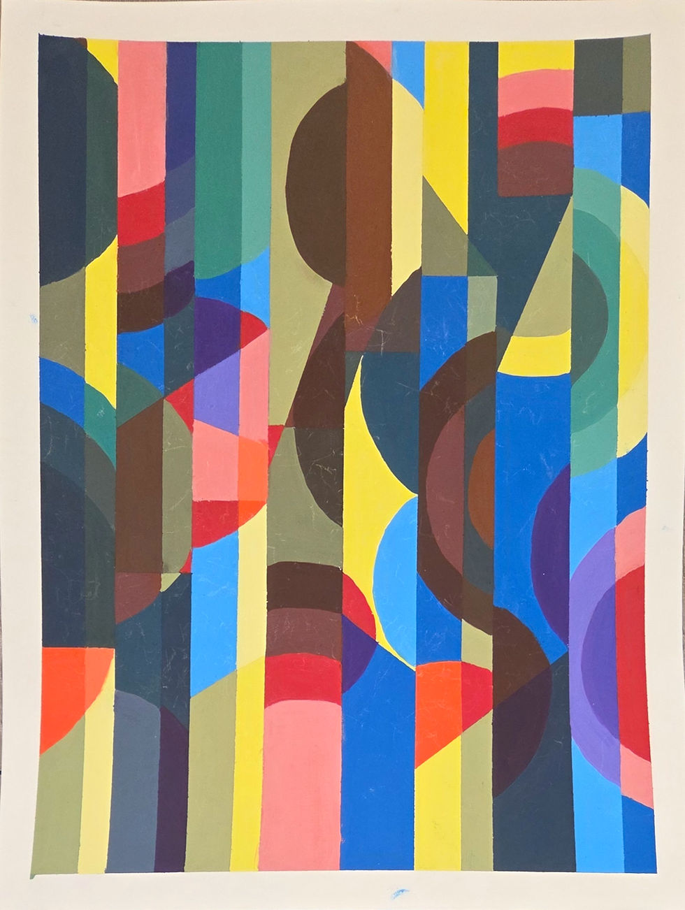
"Generations"
Study in Primary and Secondary Colors and their Tints, Tones, and Shades to create Overlapping and Transparencies
An acryla-guache painting of red, yellow, blue, violet, green, and orange in different hues on vertical registers broken up by horizontal and diagonal lines and circles.
Honestly, I surprise myself by how often I make a 'school project' a personal piece. This particular project was inspired by one my mother did in college. From a young age, I was always fascinated by the large silk canvas that was never hung on the wall because we were moving so often.
The silk strips were held together by a determined seam, without regard to what was once a neatly painted flower. My mother had cut her painting out of disappointment. But at her professor's urging to complete her project, she hastily had a seamstress sew it back together. But, not to recreate the flower. She purposefully had the panels disjointed and off-set. The overall image now evokes the intention of a more abstract design. But perhaps it really was meant to be.... I have long noticed that the petals were drawn with strict angles, the outlines creating a strict contrast with the soft, traditional colors. And despite having known the story behind the piece, I've always still considered it perfect.
When I started this project, I instantly thought of my mother's work. I don't really know how my mind went there. Perhaps it is a true successor.


Background image is the silk painting from the description.


This Man
My first project in a color theory class and a study in tints and shades of blue.
This subject has been in my mind for a while, because the deep, thoughtful (and gloomy) look has been so attractive to me. Original image features Jeonghan of Seventeen from the This Man album.

Memento Mori Still Life
Charcoal drawing of a still life display in the style of Memento Mori

"City of the Future"
Charcoal drawing of imaginative future of Savannah, Georgia


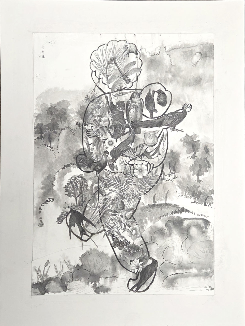
I depicted that strange and solemn image with a tinge of sorrow. 할머니 crosses a stream into distant mountains in one single step, her oblivious burden reaching out at in his own little world.
But the baby is now taller than me, about to leave for his own adventure. And 할머니 did pass out of sight one day. And I am left with my mother, to remember, each in our own way.


<할머니> "Grandmother"
A paper collage of plants and animals on an ink-wash painting of mountains.
When I started working on this project, I was suddenly sent back to an early memory. One that has returned again and again.
In the memory, everything is hazy and gray. I think my mother was walking me back from kindergarten. My grandmother was carrying my baby brother. We were approaching an intersection in a open place under development. The sky was somehow overcast and bright at the same time. I don't think the traffic light was functional. There wasn't enough traffic in the area. The few drivers that passed by knew that and sped through the area like it was a highway.
And, to my mother's horror, 할머니 (Grandmother) crossed in the middle of the street.
I distinctly remember feeling my mother's fear. And for some reason, I was calm. I did know what was going on and why my mother was scared. But I decided to not be afraid, I think, because my mother was afraid. How strange....
The memory also carries a bond through time. My grandmother, who grew up in a time when going to kindergarten wasn't even an option, my mother, who had once experienced being hit by a car, and me. Toddling along in their world, slowly realizing how much bigger and older it is than me.
And the memory begins to fade. My mother's shouts don't seem to reach 할머니. She faces away from us towards her own destination.


